i wish to find a product explore all

Bring balance to your home with seashore colors

Using soft seashore colors to bring balance to your home

Inspired by tides, waves and the natural rhythms of the earth, the Flow palette can help create a feeling of continuity and balance. Try these four decorating ideas to help your home feel in step with nature…

In today’s high-tech, high-stress world, it can be challenging to do what we know is best for our wellbeing. Achieving better balance comes from feeling in tune with the regular rhythms of nature and, at home, we need a space that reflects that natural momentum.

Our Flow palette is made up of soft, fluid tones that are inspired by the seashore – shell pink, pebble grey, sea blue. Used alongside Mauvilac Colour of the Year, Wild Wonder™, they are ideal for creating a space with a sense of balance.

A mix of light and dark shades, the Flow palette offers endless potential for experimenting with paint effects and color-blocking and, because these are warm seashore tones, they work well even in rooms with little natural light.

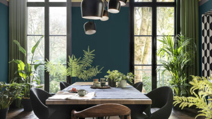
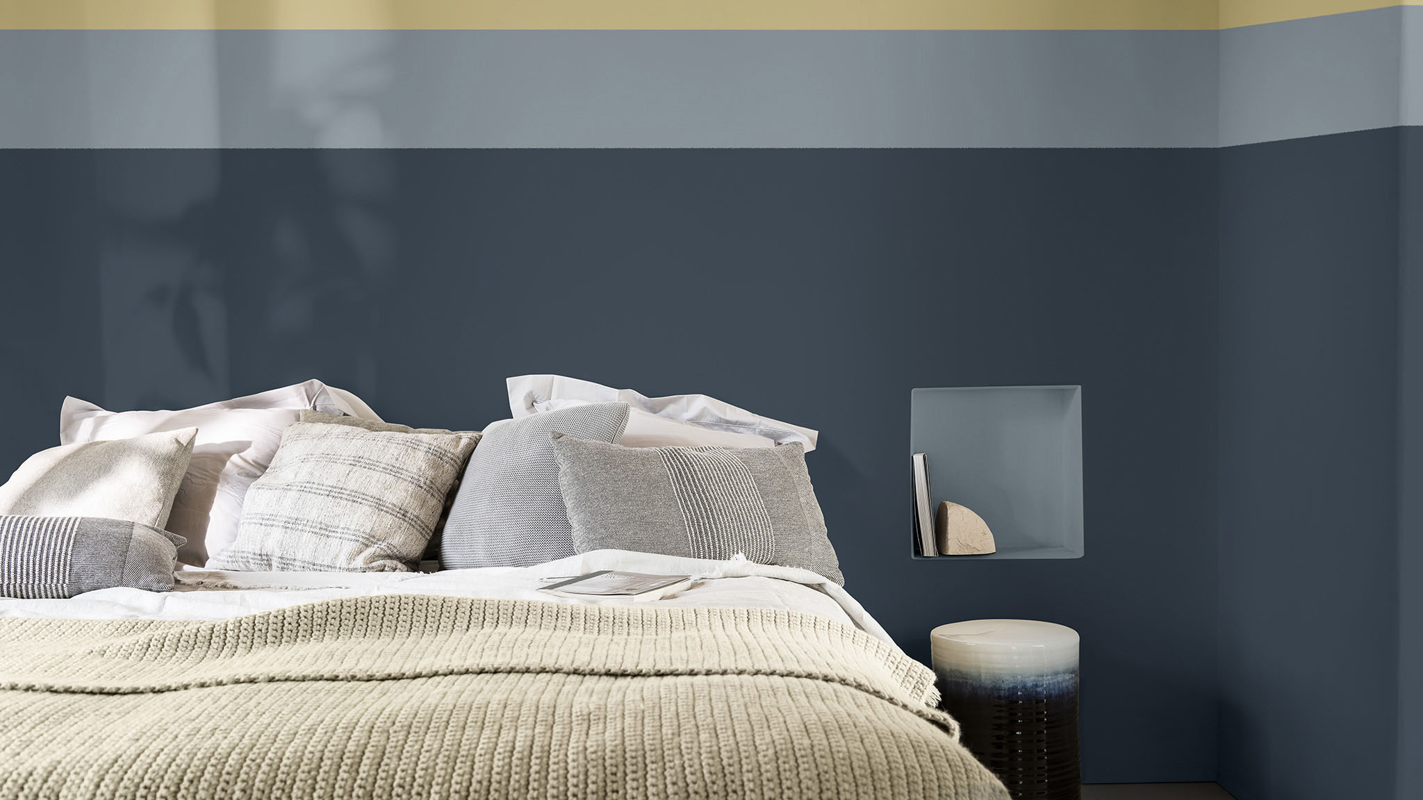
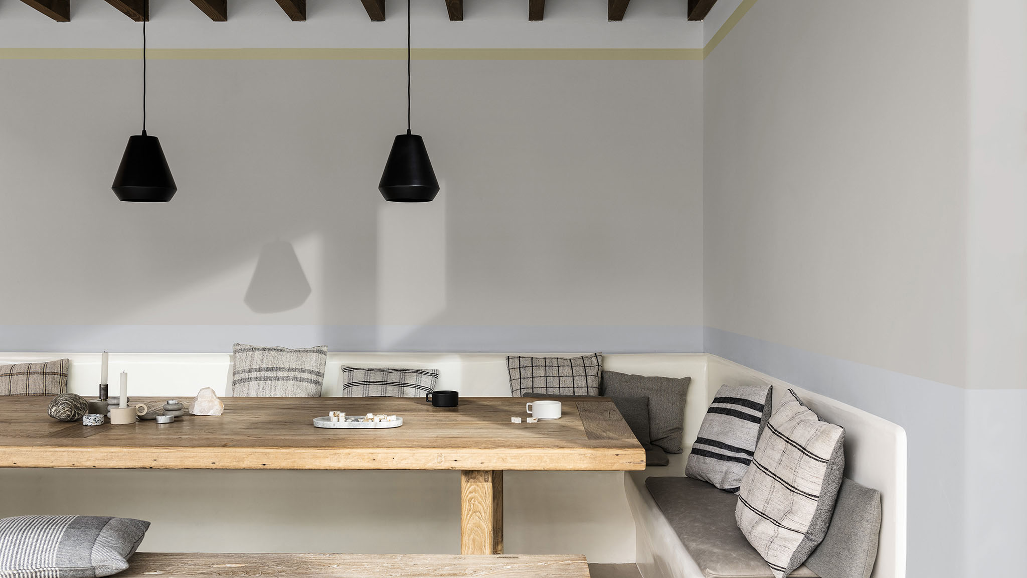
1. Create a balanced living room
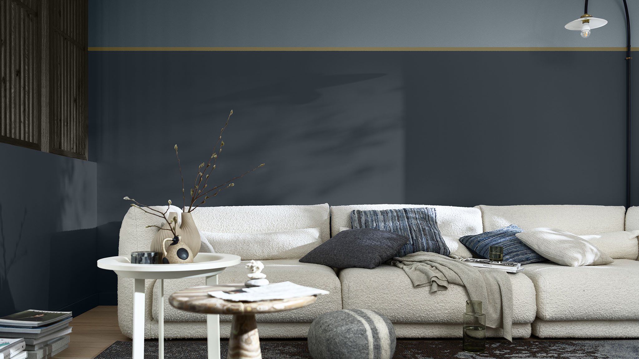
The fluid tones in our Flow palette can bring clarity to a busy family space, such as a living room. Creating a split wall effect that tops pale lilac with a soft white brings instant balance, while a thin band of Mauvilac Colour of the Year, 2023 Wild Wonder™, adds warmth and visual interest.

Which colors?
Ghost Grey 17GY 68/005 0N.00.78
Wild Wonder COTY23 50YY 49/191 G0.16.68
Silver Trophy 30BB 53/012 TN.01.71

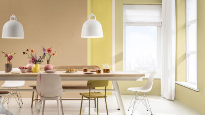
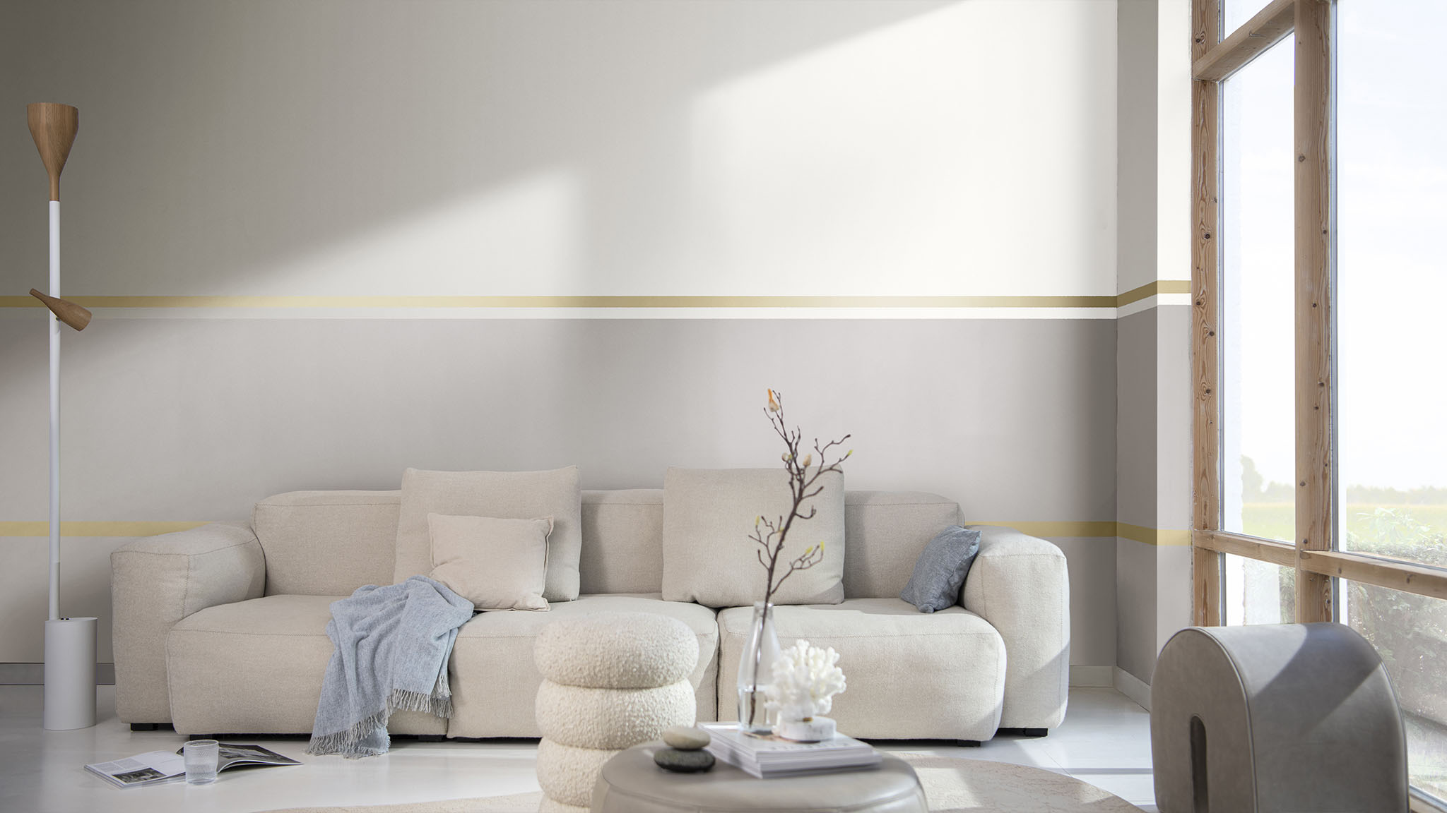
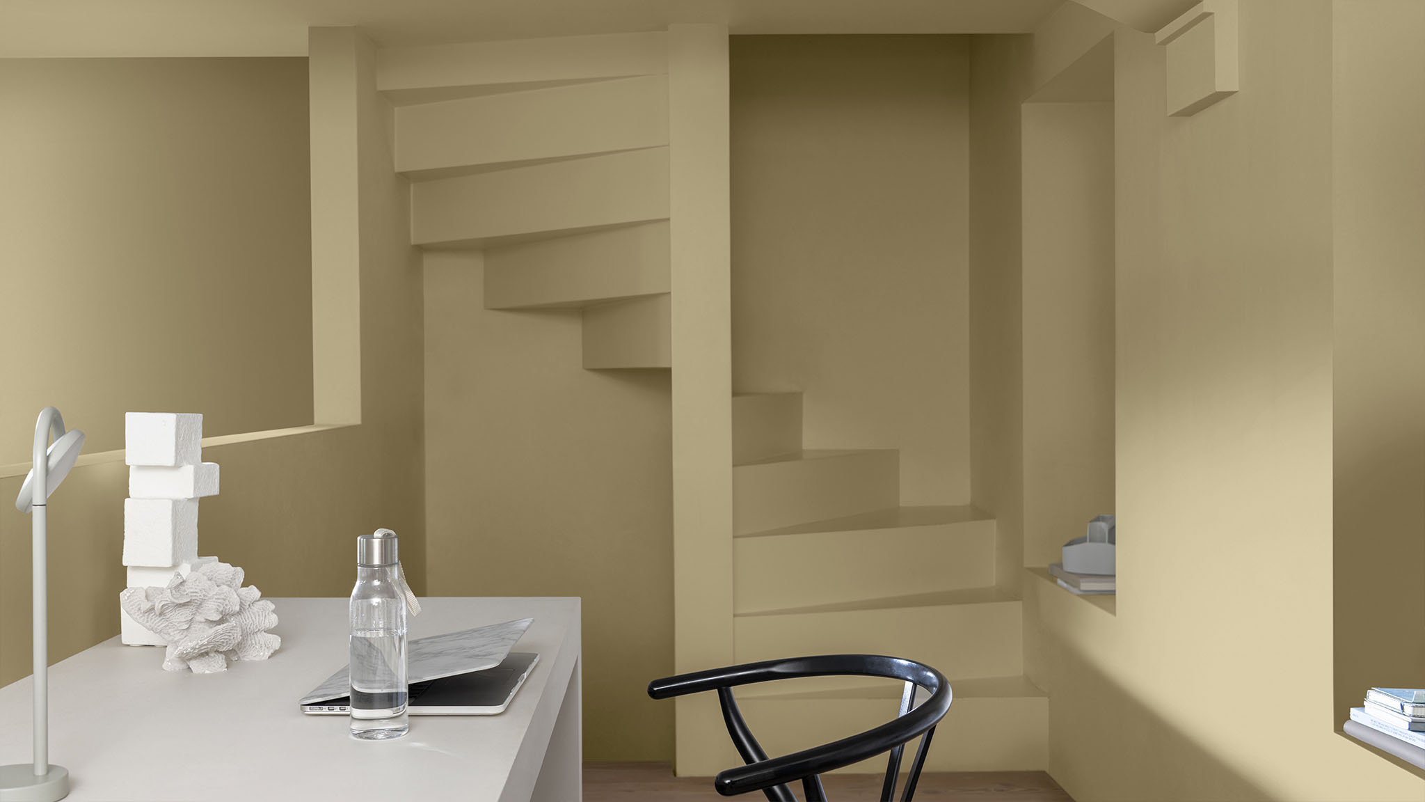
2. Open up a small bedroom
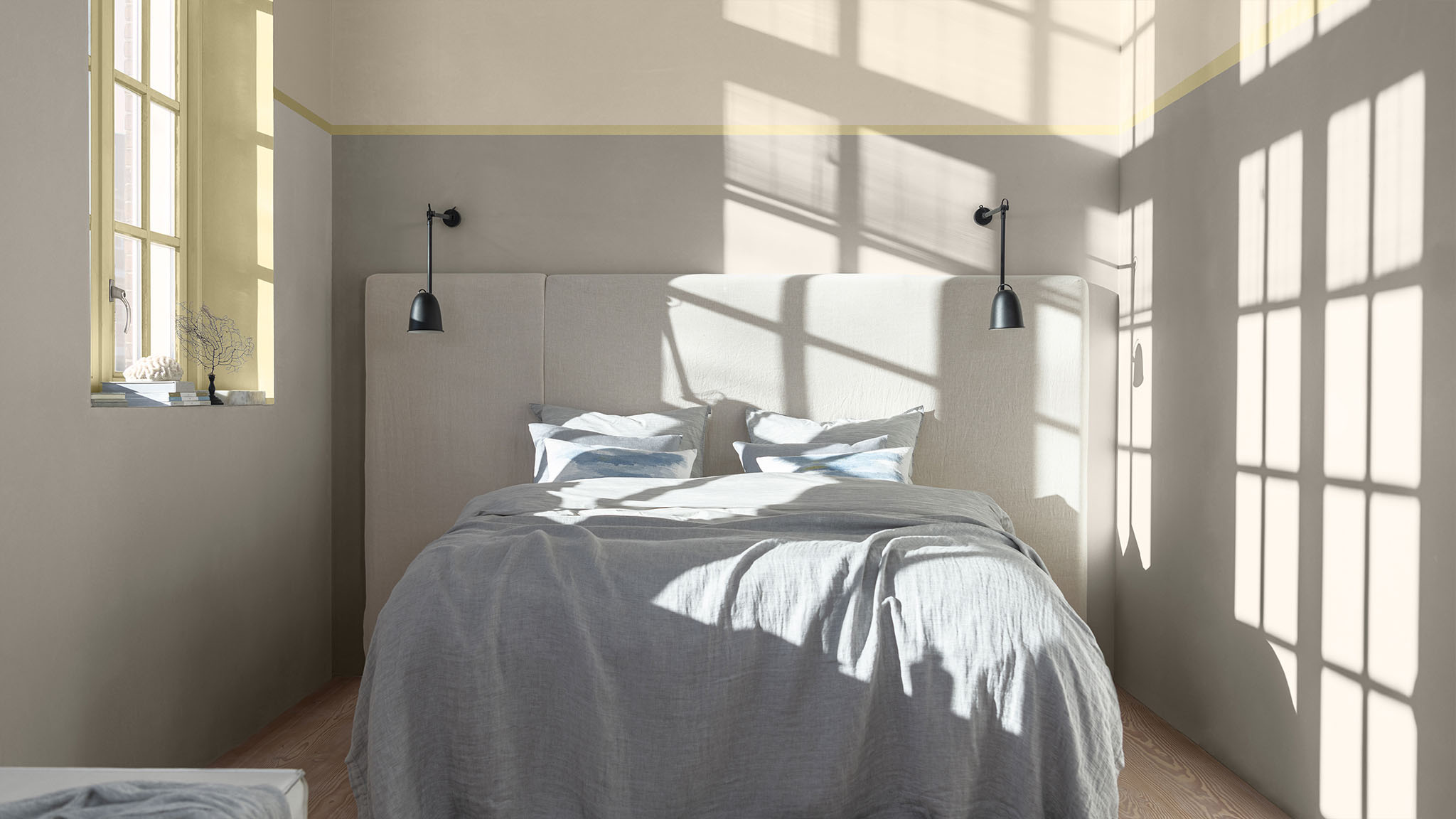
Be clever with color in a compact bedroom to make the space feel bigger. Walls painted in soft neutrals from our Flow palette help make this room feel expansive, while a horizon line in Wild Wonder™ draws the eye upwards to create the illusion of space. These are tones that work brilliantly with natural light, bringing warmth and balance, whatever the time of day.

Which colors?
Fossil Grey 30YY 56/060 F4.04.73
Wild Wonder COTY23 50YY 49/191 G0.16.68
Zeppelin 30YY 46/036 F0.03.66

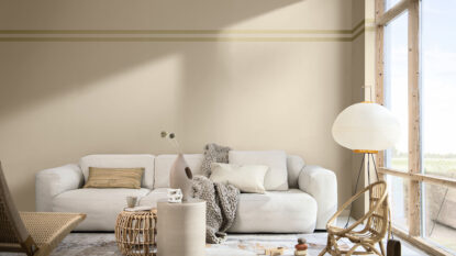
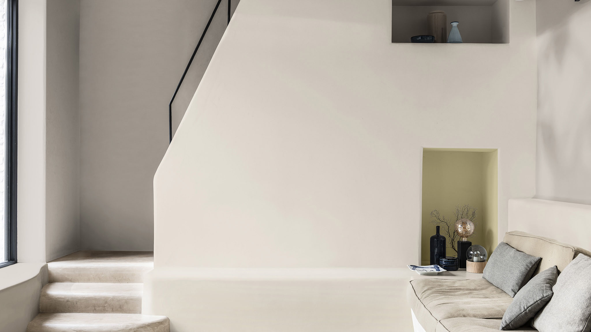
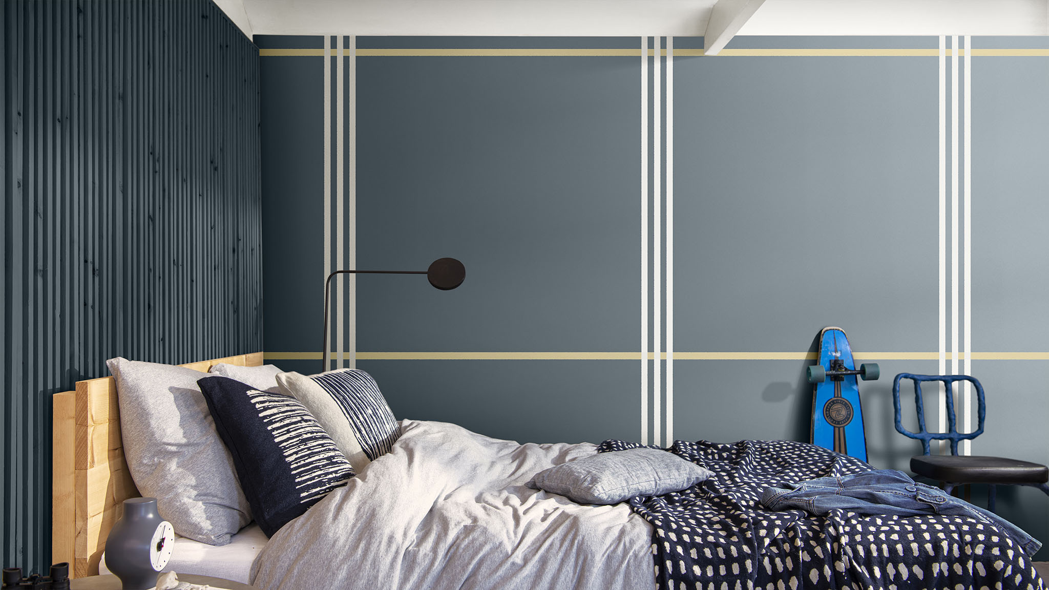
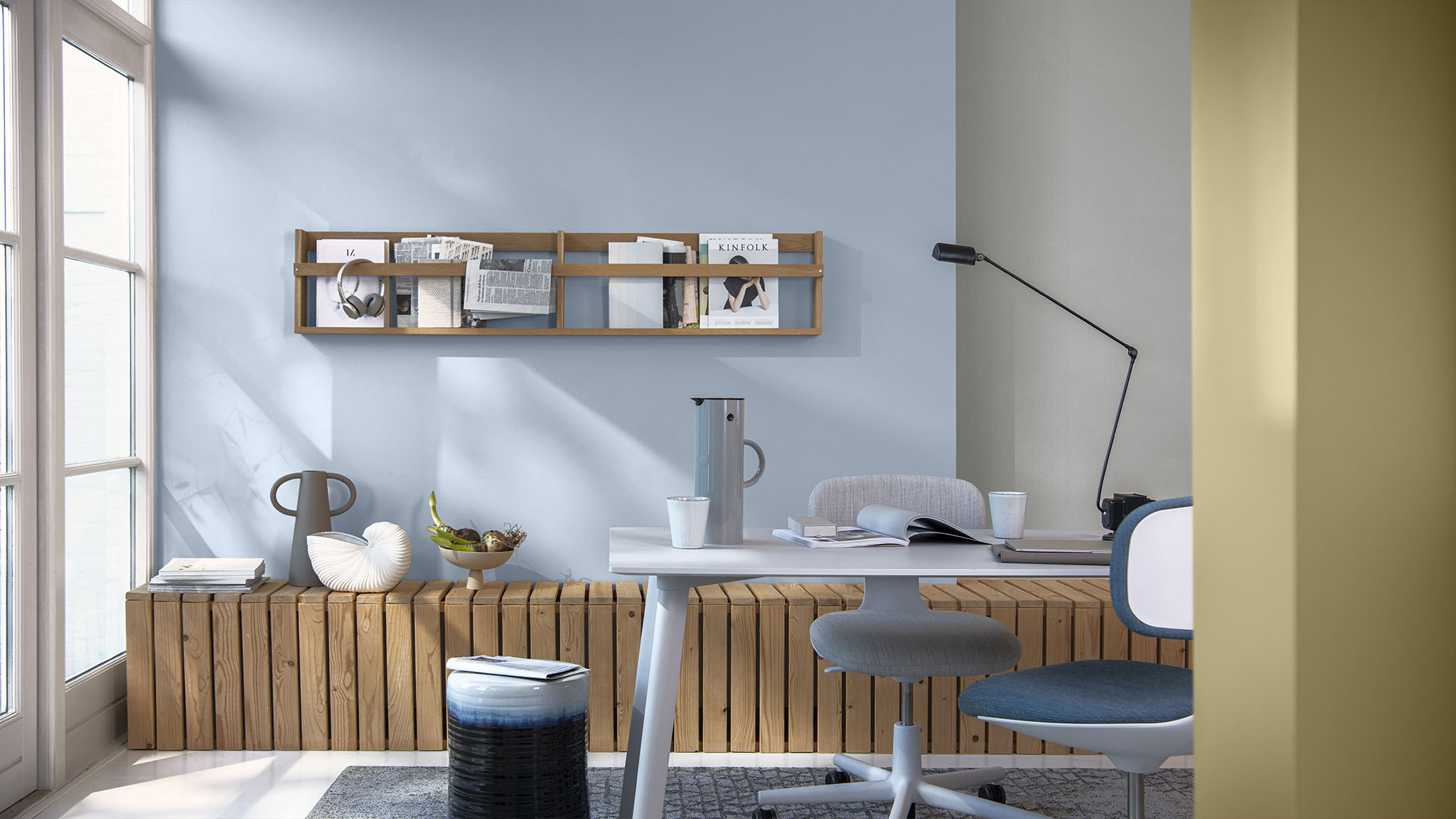
3. Use color for zoning
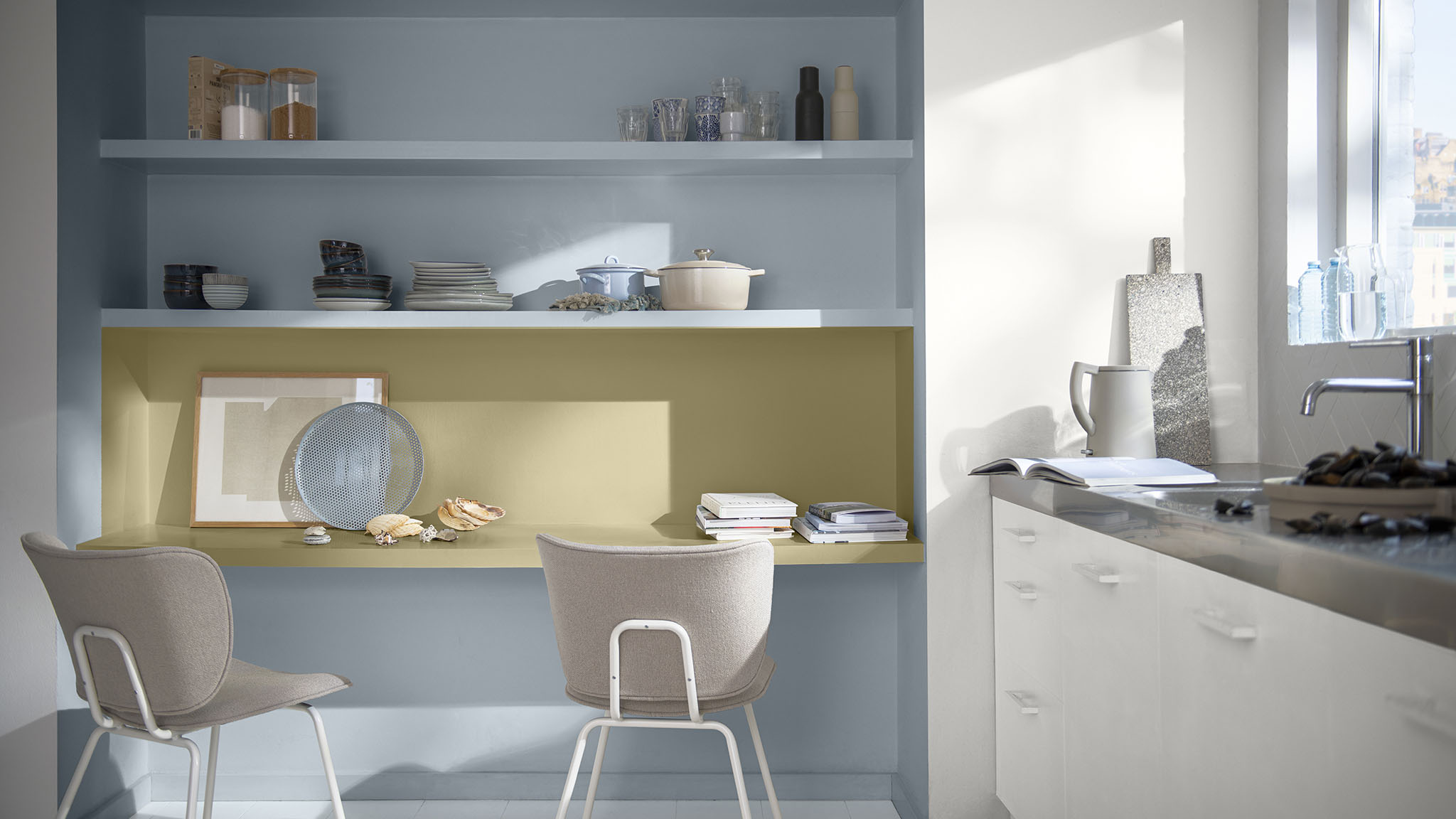
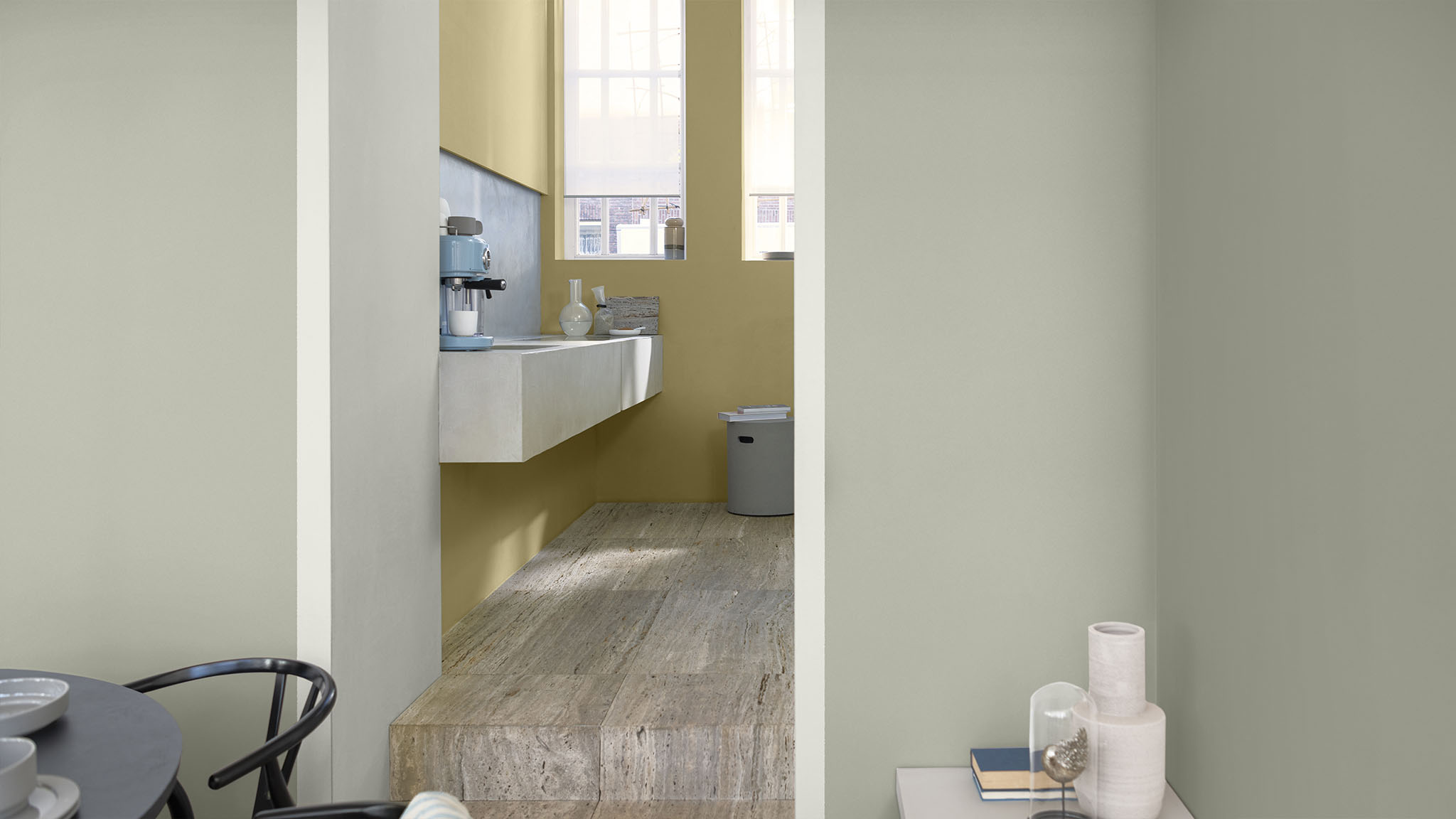
It’s easy to experiment with zoning when you’re working with one cohesive palette. Here, alongside a wall painted in a soft blue, a lighter shade is used to define the kitchen area – an effect emphasized with a stripe of Wild Wonder™. Because the colors are toning and complementary, the scheme feels fluid and balanced.

Which colors?
Bright Skies COTY22 14BB 55/113 T0.10.70
Wild Wonder COTY23 50YY 49/191 G0.16.68
Faded Denim 10BB 55/065 S9.06.72

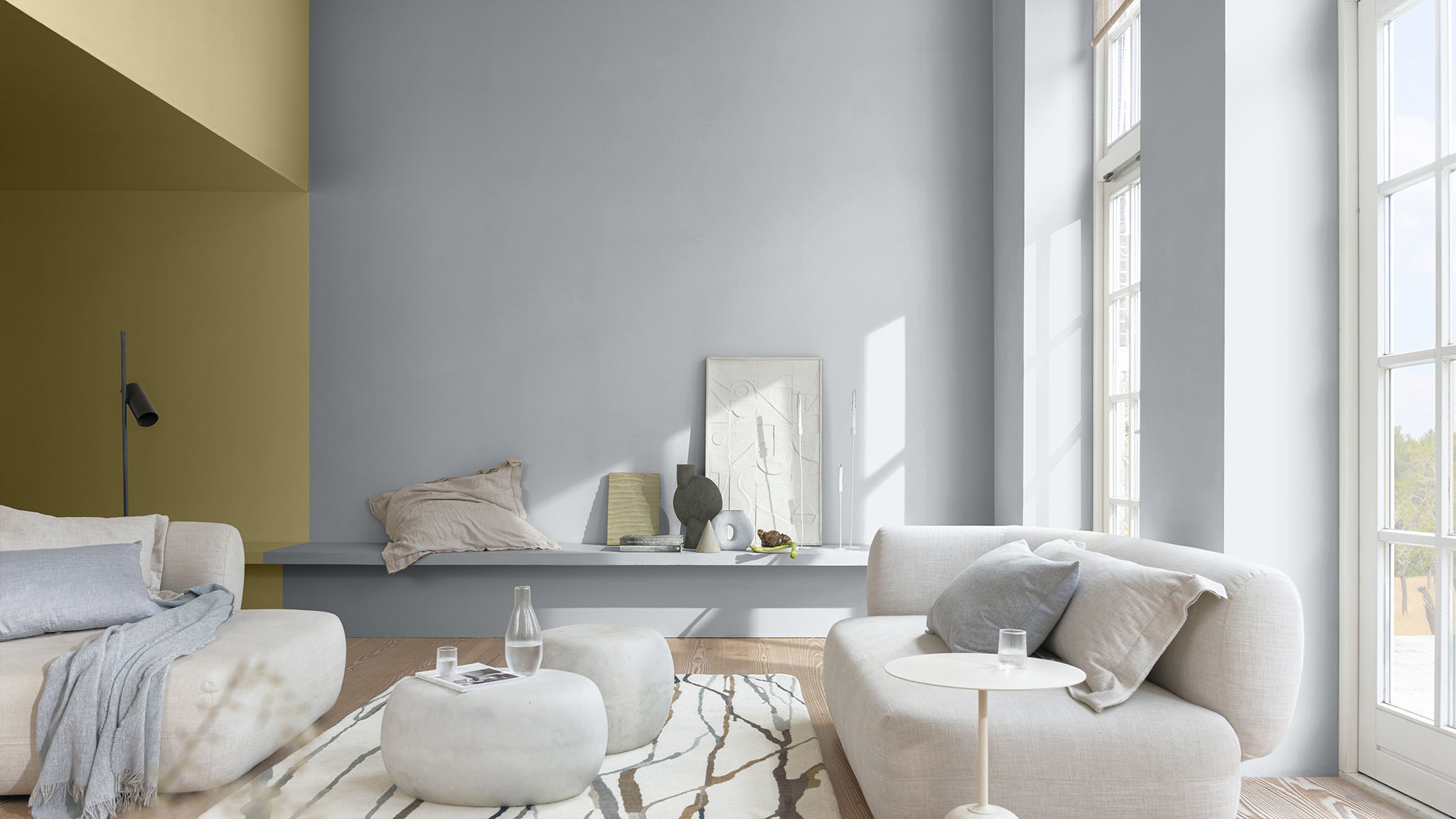
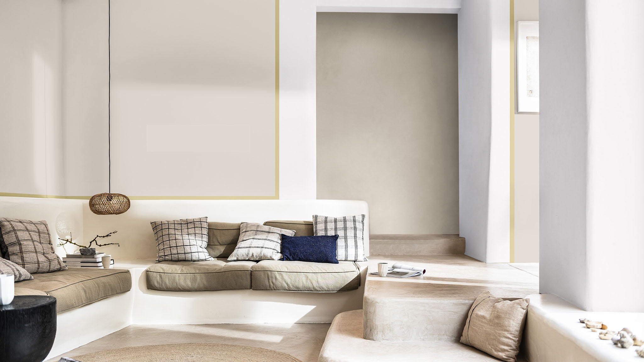
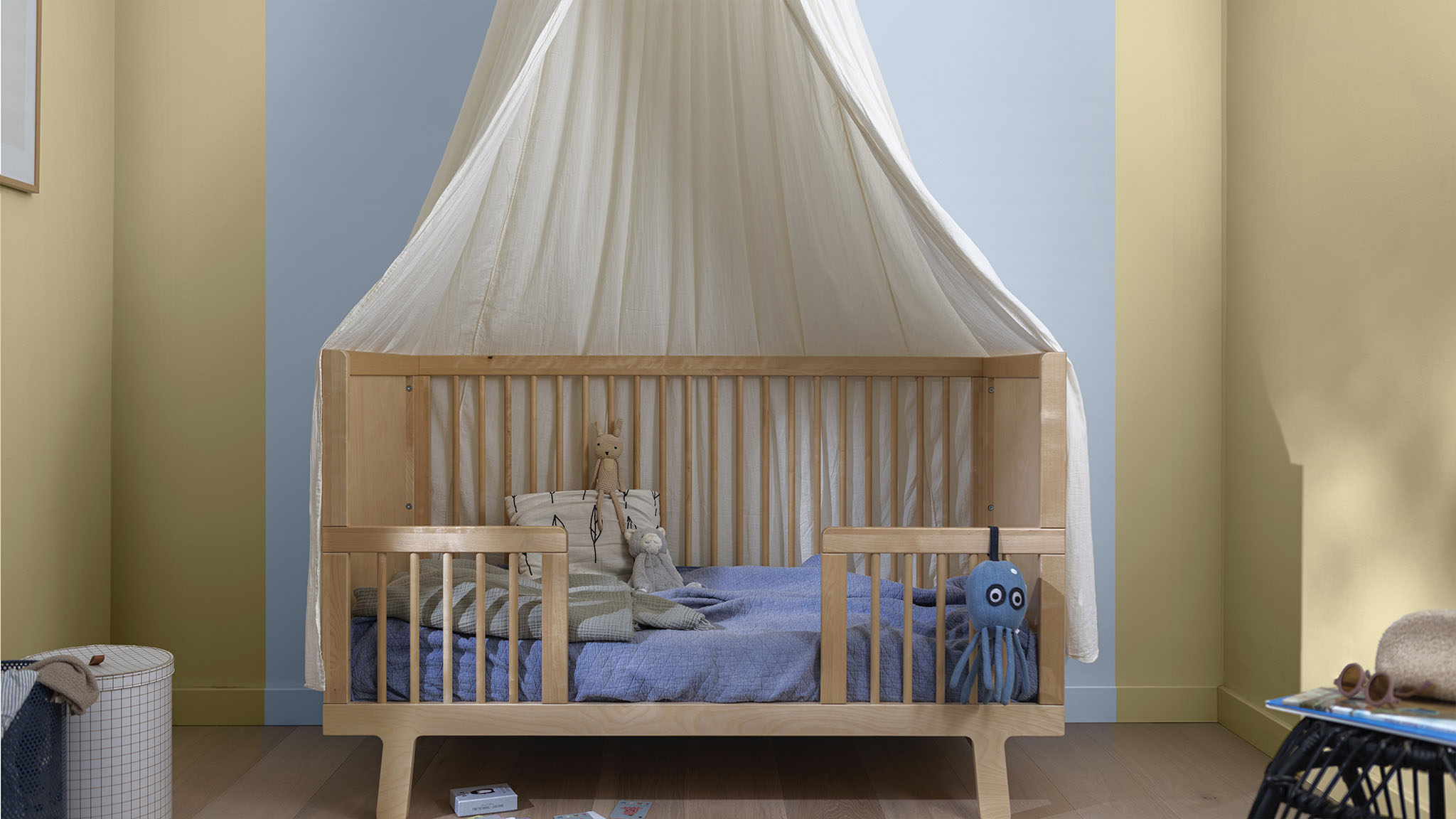
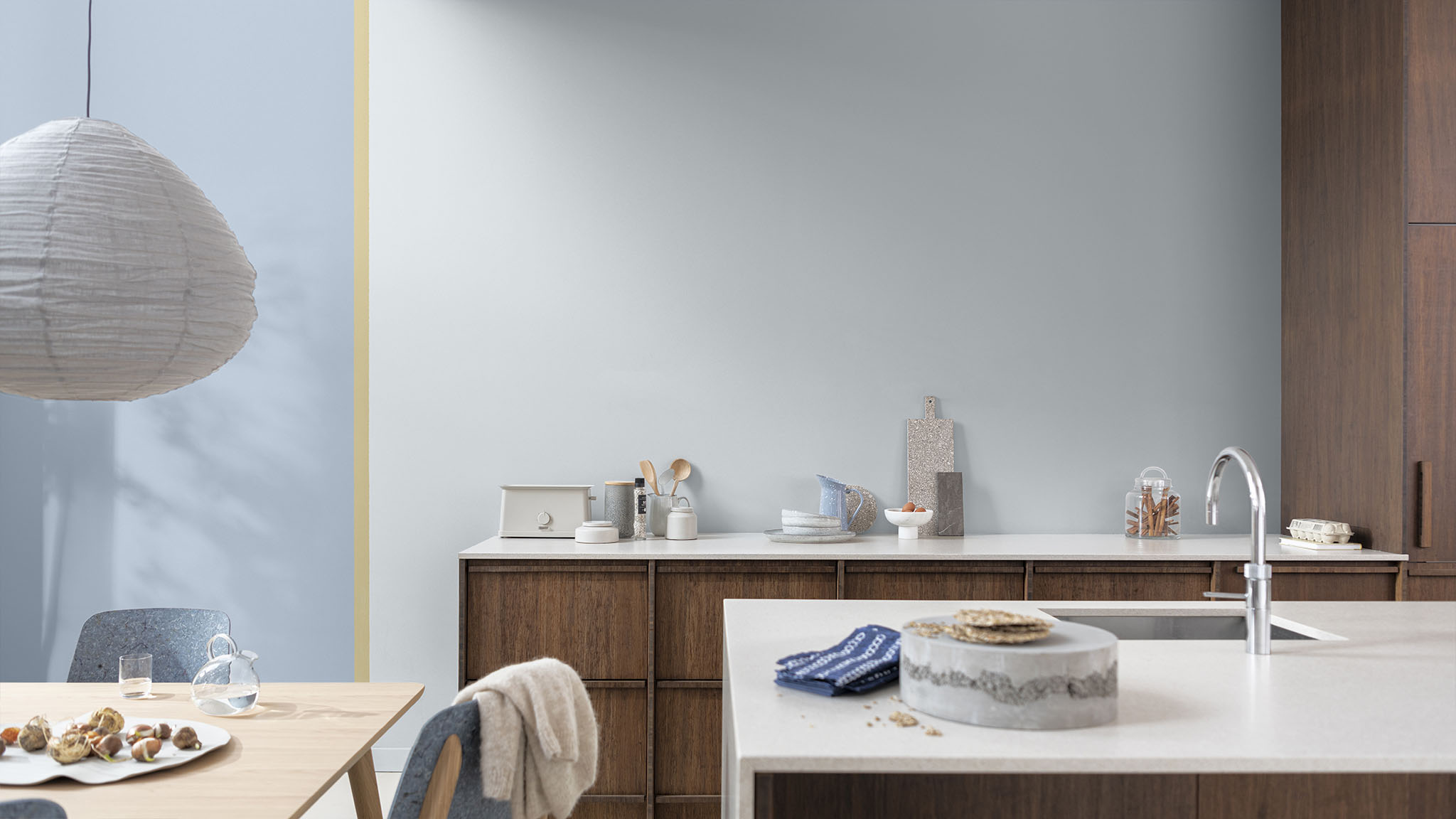
4. Experiment with color-blocking
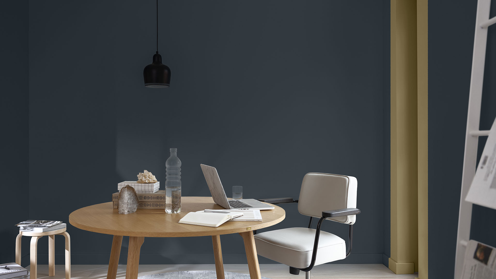
The tones in our Flow palette are perfect for color-blocking – offering you exciting combinations that feel balanced. Here, a soft blue feature wall reflects the natural light, while a pale lilac and Mauvilac Colour of the Year, Wild Wonder™, add warmth and visual interest.

Which colors?
Bright Skies COTY22 14BB 55/113 T0.10.70
Silver Trophy 30BB 53/012 TN.01.71
Wild Wonder COTY23 50YY 49/191 G0.16.68

Mauvilac Colour of the Year 2023 in more detail

Discover how Wild Wonder™ can bring the magic of nature into your home

Wild Wonder™ and its four easy-to-use colour palettes can help you feel the magic of nature in any room. For inspiration and expert tips, take a look at our step-by-step guides and videos.

back to top

Compare Products

You can select up to 3 products